Blog Post
Our New Look
- By Gavin Dimmock
- •
- 26 Feb, 2017
- •
Subtle rebrand. New website.

Welcome to our very first blog post.
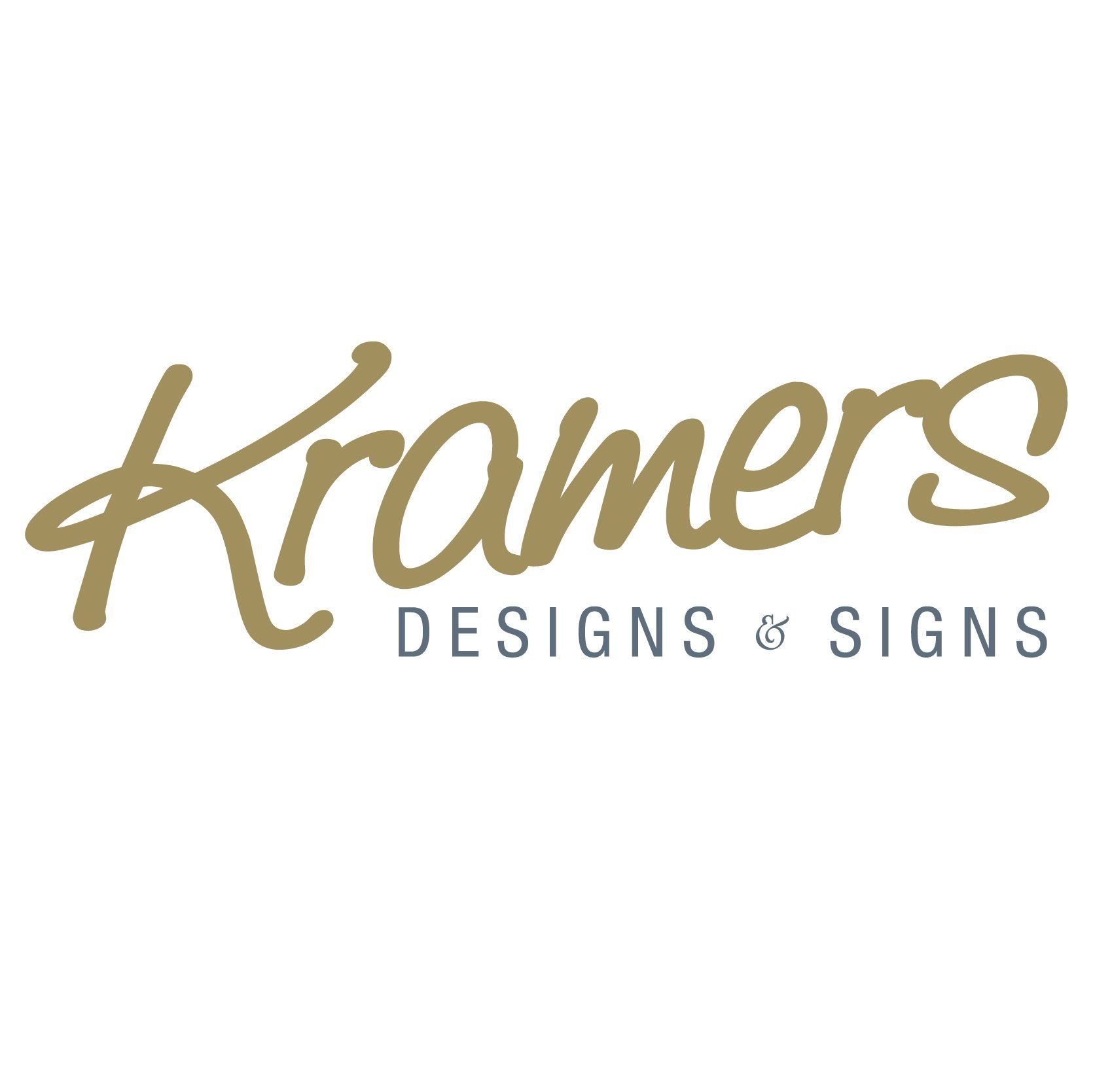
We have undergone a subtle rebrand and are delighted to reveal our new look to you.
Our distinctive "Kramers" has been retained whilst being discreetly altered and improved. Our house font has been replaced with Helvetica Neue LT Std, a classic sans serif typeface giving a crisp, smart and professional look. We chose University Roman for the "&" for its gorgeous shape and form. Our colours have been updated and now look even better than ever in classic gold and gentle grey.
Lots has taken place behind the scenes to improve our infrastructure and performance. Top that off with our swanky new website showcasing our most recent projects, some fabulous new business cards and an enhanced presence on social media - check out our new Instagram account at "kramersdesigns" - we are set for a great 2017 and beyond.
We hope you like our new look. If you do, why not get in touch and let us know what you think. Maybe we can do the same for you?
Until our next blog, have a great week.
Kramers
Share
Tweet
Share
Mail
CONTACT US
info@kramersdesigns.co.uk
Springfield Grove, Brighouse
West Yorkshire. HD6 2HZ
COPYRIGHT KRAMERS DESIGNS & SIGNS LTD 2017
